Written By: Madison Bigelow
I, like so many others, have fallen victim to the cascades of book reviews that have taken a small corner of the internet hostage. Whether it be #booktok, a social media influencer, or just an old friend on Instagram who’s sharing their latest read, reading has become “trendy” again and public discourse about literature has become increasingly visible online in the last few years.
Don’t get me wrong– I LOVE that, encouraged by social media, people who may have never considered themselves readers are starting to pick up books for enjoyment. Nevertheless, I’ve noticed that a lot of these books that appear on my feed look…the same. For me, this is especially apparent with fiction that’s seemingly advertised to young adult audiences. Let’s look at some examples:

For instance, each of these covers feature scrawling, handwritten text that’s overlaid onto a moody, somewhat vague image characterized by muted colors and mystery. While these covers might give the impression of intimacy because of the script, none of them are quite inherently specific to the novels themselves. Given that each of these books are quite different from one another, their visual similarities are not revealing of the unique contents of their respective narratives.

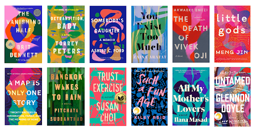
Possibly, these aesthetic similarities are even more apparent in this side-by-side image. At first glance, they’re beautiful: vibrant washes of color swirl underneath bold, assertive text that really catches the eye. However, upon closer examination, most of these covers offer very little insight into the contents of the book or why a prospective reader should pick it up in the first place. In other words, they all give off the same hazy, nondescript vibe. While there isn’t anything wrong with these covers, I think that their aesthetic designs have yet to reach their full potential. And I could go on (and on…).
Ultimately, I find that these design trends do a disservice not just to authors everywhere, but their audiences, too. For better or worse, people do judge the media they consume at face value; while publishers may think that modeling new novels’ aesthetic designs from current bestsellers might reach a wider audience, these efforts eventually fall flat. In reality, current aesthetic trends just work to homogenize novels’ visual appearance, despite their differences in actual contents. Authors are left with book covers that misrepresent their narratives, rendering readers bored with an obvious lack in artistic variety.
For everyone involved, – the writer, the reader, the publisher – I think it would be a welcomed change to just forget about these current trends in commercial publishing. By really honing in on the differences, the peculiarities, the eccentricities that a book has to offer, aesthetic choices can be used as tools for novels to stand out against others in a particular genre (and will also lead to a more vibrant bookshelf!).

You must be logged in to post a comment.